
HOW CABINET DOORS AND FINISHES CAN MAKE A KITCHEN LOOK BUSY
A cabinet door can look lovely on its own and feel surprisingly busy across a kitchen. Its edges repeat, its finish adds pattern, and nearby surfaces bring their own lines and colors. Even with clear countertops, those details can compete for attention. The crowded feeling comes from their combined effect, though each choice may appeal to you separately.
That matters when choosing assembled kitchen cabinets: liking a door sample is only part of judging how the kitchen will look. You also need to picture that door across drawers, narrow cabinets and long stretches of wall cabinets, beside the surfaces you plan to keep.
A calmer result can still include wood grain, rich color or decorative doors. The useful first step is to find which details compete most strongly. Understanding how those details build up helps you keep the character you enjoy and make focused changes around it. Start with the shapes on the cabinet fronts, because their repeated outlines create the pattern that every finish will sit on.
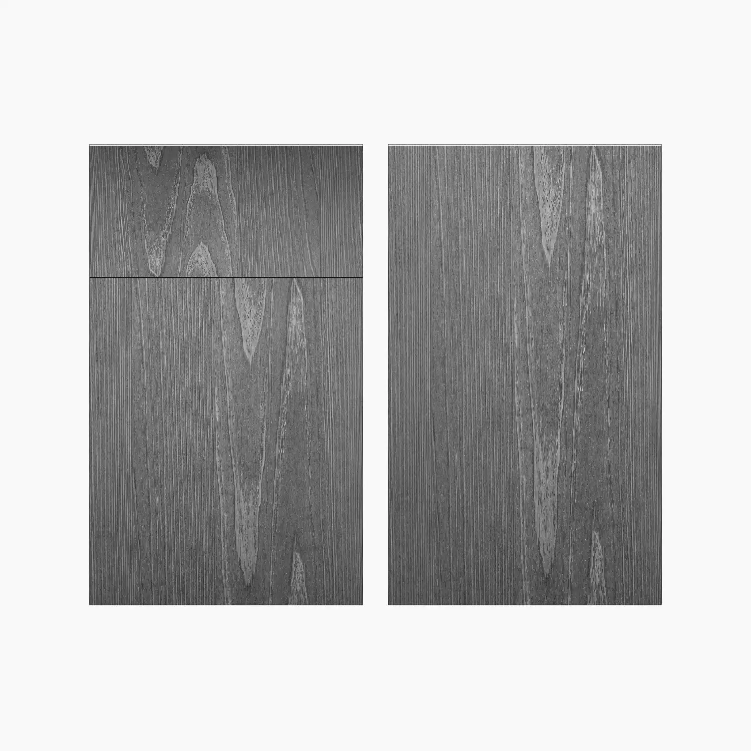
Repeated door details can crowd a cabinet run
Each door adds outlines, and those outlines repeat across the cabinets. A profile is the shape and detail around a door panel. A flat front has little surface detail, while a framed panel adds an inner outline. Raised panels or decorative grooves add more edges within that outline.
On one broad sample, those details may feel well spaced. Picture the same profile on several narrow doors beside a stack of drawers. Each front has its own border, and the gaps between fronts add another set of lines. The detail can seem much denser even though the door style has stayed the same.
Pay attention to where fronts divide, too. Several shallow drawers create a different pattern from one tall door. A drawing of the actual layout shows this difference better than a single sample can.
Detailed doors can still suit a quiet kitchen. Their outlines may be the feature you want to notice, especially beside simple surrounding surfaces. The question is how much repeated detail you enjoy across the full run. Once you can see that pattern, consider what the finish adds to it.
Cabinet finishes add more than color
Kitchen cabinet finishes affect color, pattern and shine. Two doors in similar shades can look quite different because one has an even surface while the other shows strong grain or highlighted edges.
Grain is the visible pattern in wood. Long, gentle lines may look different from bold streaks or frequent changes in tone. A stain can leave that pattern visible, so the eye sees both the door outline and the movement within it. Judge how much the finish varies alongside the profile you chose.
For example, picture the same framed door in an even painted finish and a stain with noticeable grain. The painted version lets the frame supply most of the detail. The stained version adds another pattern inside it. Either could work, but the second combination gives you more visible detail to consider across many fronts.
A glaze that darkens recessed areas can make grooves and panel borders stand out. That may suit someone who wants decorative detail to show clearly. It can also make an already detailed profile more noticeable.
Contrasting island and perimeter colors add a larger division. Repeating one of those colors elsewhere may help connect the areas, though there is no fixed color limit that suits every kitchen.
Sheen means how shiny a finish looks. It changes how much reflected detail you see, which makes lighting part of the finish decision.
Lighting changes how cabinet finishes look
Light can make existing cabinet details more noticeable. A glossy door may reflect a window, a hanging light or objects across the room. Those reflections add visible shapes that a small finish chip may never show.
The effect can change as you move. A reflection that seems distracting from the kitchen entrance may disappear beside the sink. Consider the views you use most, including the view from a nearby dining or living area if the cabinets are visible from there.
Light falling across a door can also cast shadows along raised edges and grooves. A profile that looks subtle under even showroom light may seem deeper beside a bright window. Turning the sample toward and away from the light helps show that difference.
A matte finish may soften distinct reflections, but grain and door outlines remain visible. Choosing less shine will only address the part of the busy effect caused by reflections.
View the sample in daylight and with the lights you normally use after dark. Keep it upright, as it will sit on the cabinet. Once you understand how light changes the door, widen your view to the countertop, backsplash and floor that share the room.
Nearby surfaces can compete with cabinet details
Cabinet details can feel busy when surrounding surfaces have equally strong patterns. Door borders, countertop streaks and backsplash joints may all draw attention within the same view. The effect depends on how those patterns work together and which one you want to notice first.
Picture decorative doors beside a backsplash with small tiles and strongly contrasting grout. The door edges create one network of lines; the tile joints create another. Keep the doors the same and imagine a backsplash with a more even appearance. The cabinet detail now has more space around it, without changing the door style.
A strongly patterned countertop can create a similar conflict. Its movement may compete with visible grain directly below it. Flooring adds to the picture, particularly where its boards or tile lines are easy to see from the kitchen entrance.
Repeated details can also connect surfaces. A wood tone repeated in another part of the room may help the cabinets belong. Several unrelated patterns, each with sharp contrasts, may feel more scattered. Similarity alone is not enough, though; consider how strong each pattern appears from across the room.
Knobs and pulls add repeated shapes as well. Their size, outline and contrast with the doors can either draw attention or sit quietly against the fronts.
Room size does not settle the issue. A small kitchen can feel calm, and a large one can contain many competing details. Finding the strongest conflict gives you a more useful starting point.
Simplify the strongest conflict first
Choose the feature you most want to keep, then reduce the detail competing with it. This gives each proposed change a clear purpose and helps avoid stripping away everything you like.
If decorative doors are your favorite feature, keep them in the comparison. Try a quieter backsplash beside them while leaving the finish unchanged. You can then see whether the surrounding pattern caused the crowded feeling. Changing the door, finish and backsplash at once makes that harder to judge.
If a patterned countertop must stay, compare a simpler door profile beneath it. Keep the cabinet color similar during that comparison so you can focus on the outlines. If the profile already feels right, a separate comparison can test a finish with less visible variation.
Existing cabinets deserve the same careful check. Temporarily clear countertop objects and towels that interrupt the view. Then consider whether the repeated knobs or pulls draw more attention than you want. These checks may show that the doors themselves are not the main concern.
Keep enough detail to preserve the kitchen's character. A change earns its place when it reduces a specific conflict you can name. That gives you a focused question to take into sample selection: does this door and finish work better beside the feature that stays?
Check assembled cabinet samples against the whole kitchen
Assembled cabinets arrive with their cabinet boxes built, so no cabinet-box assembly is needed before installation. That describes how they arrive. It does not tell you whether their door details and finishes will suit your room.
Use the same visual checks for fully assembled kitchen cabinets that you would for any cabinet choice. Compare the actual options for the selected line, since a general style category cannot confirm every door, finish or cabinet combination.
- Compare full door samples. A small color chip cannot show how the border, center panel and finish work together. Use comparable samples when judging two options.
- Place samples upright beside surfaces you plan to keep. Include the countertop and backsplash samples where possible. Keep their planned positions in mind rather than spreading everything flat on a table.
- Check them under normal lighting. View them in daylight and evening light, watching for reflected shapes and shadows along the door edges.
- Step back to a normal room distance. Decide whether the grain and outlines still attract more attention than you want. Include the view from the entrance.
- Review a straight-on drawing of all cabinet fronts. This shows how doors and drawers repeat across the planned layout. Look at assembled base cabinets and wall cabinets together, since their divisions may differ.
Confirm that the chosen door and finish are available for the needed units and visible side panels. An unexpected replacement can add a contrast you never intended.
Keep the detail you enjoy if the full arrangement feels comfortable. If it still seems crowded, return to the strongest competing element and test one focused change.
Keep the detail you enjoy and give it room
Cabinet doors and finishes look busy when their repeated details compete more than you want. The useful decision is which feature deserves attention and what around it can become quieter. That leaves room for decorative doors, wood grain or a contrasting island without requiring every surface to stand out.
Make that decision with the whole kitchen in view. A sample you love up close still needs to work across the planned doors and drawers, beside surfaces you plan to keep and under everyday light. If the combination feels crowded, name the conflict before changing the design.
Keep the feature that matters most, test a simpler choice beside it, and compare again from a normal viewing distance. You can stop when the details you value remain clear and the competing patterns no longer pull your attention away from them.